Create Web Sites

  • Subscribe to our RSS feed.
  • Twitter
  • StumbleUpon
  • Reddit
  • Facebook
  • Digg
Showing posts with label Paolo Rivera. Show all posts

Sunday, 2 September 2012

Painting Spider-Man

Posted on 21:00 by Unknown

By Paolo Rivera


Mythos: Spider-Man, Page 22. 2007. Gouache and acrylic on bristol board, 11 × 17″.


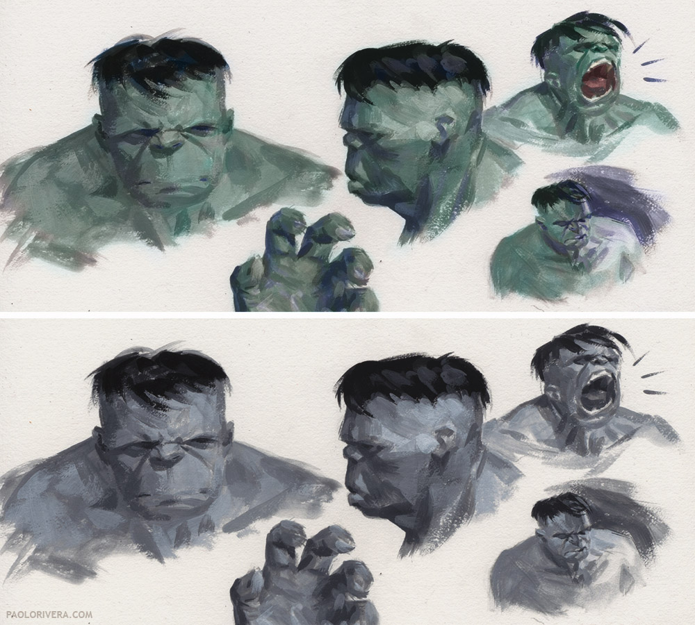
Just a quick post today (but with lots of artwork).  By this point in my career (2007) I had settled into what would become my standard painting technique: a monochromatic underpainting in gouache, followed by a thin layer of Acryla Gouache for color, all on top of 11 × 17″ bristol board (standard size for comic book art).  I use mostly gouache these days, but it's still the same basic process.


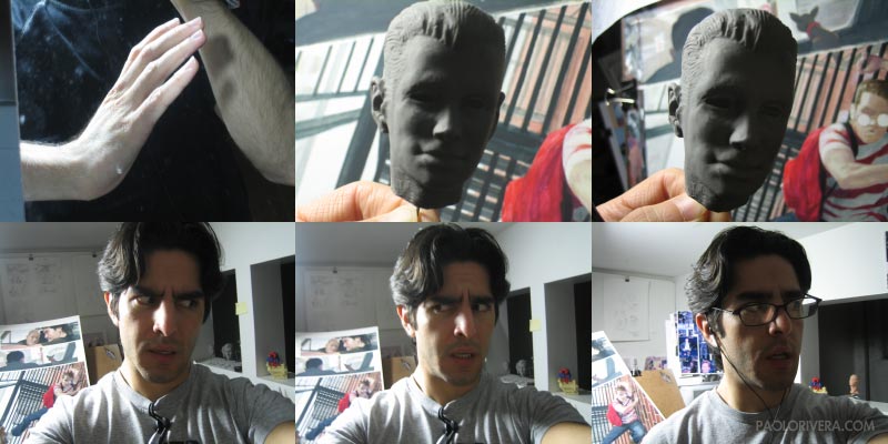
I've also included some "Wacky Reference" from the weekly feature on my own blog. I'm nearing the 200th installment and celebrating with a contest. Full details here. It's your chance to win an original painting from me, and be featured on my blog. Happy Labor Day!


Mythos: Spider-Man, Page 1. 2007. Gouache and acrylic on bristol board, 11 × 17″.


Mythos: Spider-Man, Page 9. 2007. Gouache and acrylic on bristol board, 11 × 17″.


Mythos: Spider-Man, Page 13. 2007. Gouache and acrylic on bristol board, 11 × 17″.


Mythos: Spider-Man, Page 17. 2007. Gouache and acrylic on bristol board, 11 × 17″.


Mythos: Spider-Man, Page 11. Acryla Gouache on bristol board, 11 × 17″.


Mythos: Spider-Man, Page 7. 2007. Acrylic and gouache on bristol board, 11 × 17″.


Pencils


Digital Color Study


Layout. Pencil on paper, 4 x 6".


Read More
Posted in Paolo Rivera | No comments

Sunday, 19 August 2012

Painting Ghost Rider

Posted on 21:00 by Unknown
By Paolo Rivera


Ghost Rider Studies. 2006. Acryla Gouache  on bristol board, 8.5 × 12″.


After painting Mythos: Hulk completely in grayscale, I felt the urge to return to color for my next project, Mythos: Ghost Rider. I had gotten fairly comfortable with Acryla Gouache on board, so when I saw the full-spectrum set of 12 colors at Pearl Paint in Chinatown, I couldn't resist. You've all had that feeling: if you just got this set of paints, or that brush, your mad skills will have the chance to truly shine.


Mythos: Ghost Rider, Page 23. 2006. Gouache and acrylic on bristol board, 8.5 × 12″.


For once, it was sort of true. My approach to oil was mostly opaque, meaning that nearly every color that appeared in the final painting had to be painstakingly mixed prior to application. Working semi-transparently meant I had more freedom to modulate color on the fly, adding more or less water to achieve a wide array of value and saturation with just one pigment. Because this sped up the process, my mark-making become a little more natural and confident.


Mythos: Ghost Rider, Page 21. 2006. Gouache and acrylic on bristol board, 8.5 × 12″.


I struck gold once again, this time at the Dick Blick in SoHo. The Masterson Sta-Wet Palette had always called to me from the aisles, but I finally had a good excuse to give it a try now that I was a dedicated acrylic painter (Acryla Gouache is an acrylic that dries to a matte finish). I now own 3 of the palettes, one of each size. The key to the system is a wet sponge that rests below a sheet of semi-permeable paper. This, coupled with the lid, can keep paint fresh for days, even weeks. I had long ago rigged a somewhat similar contraption that involved wet paper towels and a Ziploc bag, but having a mixing surface that stands up to a palette knife makes all the difference.


But aside from the shift in accessories, I had undergone a mental shift as well. By this time, I had built up a side gig doing watercolor commissions at comic conventions. This side-income had the side-benefit of reintroducing me to transparent color mixing. At this stage in my career as a comic book painter, one of my primary concerns was how to distinguish myself from Alex Ross, who was (and is) a huge influence on me. You've probably heard of him. He works in watercolor and gouache, laying transparent color over a monochromatic underpainting. I get this process — it's how my brain first learned (circa high school) to achieve the desired results.


Mythos: Ghost Rider, Page 4. 2006. Gouache and acrylic on bristol board, 8.5 × 12″.


Now that I wasn't worried about aping his style, I felt free to employ his transparent layering process, adding opaque notes where I saw fit. As time went on, my paint application would become increasingly transparent, especially as, years later, I moved on to traditional gouache with just hints of watercolor and acrylic. Having used all 3 media extensively, I'm familiar with the strengths of each, and use them accordingly, sometimes mixing them on the palette as well as the painting.


Mythos: Ghost Rider, Page 4. 2006. Acryla Gouache on bristol board, 8.5 × 12″.


That being said, Acryla Gouache has a couple of unique advantages. It's particularly well-suited for complicated subjects, such as architectural details and cluttered spaces. It has great covering power and, when dry, can even be glazed. For the same reasons, it's great for lettering and graphic elements, an essential component to any comic. I've never lettered any of my own work, but I've always tried to do my own sound effects. (I even use it as white out for my inked work.)


Mythos: Ghost Rider, Page 1. 2006. Acryla Gouache on bristol board, 8.5 × 12″.


As always, my creative approach is a very structured process that involves a gradual refining of ideas and subject. This is the result of years of deadlines, coupled with editorial review, but it works well and I haven't found a better way of gettings things done in a timely manner. Since I can paint directly over the white surface of my drawing, no transferring or projection is required.


Paints and Pencils


I prefer to leave the underlying drawing unfixed so that paint can seep into the bristol board and take hold. One of the reasons I eventually switched to straight gouache (as opposed to Acryla Gouache) was because the acrylic seals the paper after several passes, even when watered down. I prefer to have the surface act as a sponge, soaking up each stroke as it's applied. This has resulted in many of my originals being mistaken as prints.


Digital Color Study and Pencil Layout


This particular scene is based on a famous biker bar in Daytona Beach called the Boot Hill Saloon. That's my Dad at the bar, always willing to help me with research. The bras hanging from the ceiling were also inspired by reality. You can't really tell here, but the floor is covered in peanut shells.


Mythos: Ghost Rider, Page 5. 2006. Acryla Gouache on bristol board, 8.5 × 12″.


In addition to reference photos, I also made 3 maquettes for the main characters (they're a fantastic way to procrastinate while still getting something done). For Ghost Rider, I even made a little hinge for the jaw to move. I still make maquettes for myself, but now they're mostly digital. If there's one piece of advice I have for aspiring comic book artists, it's that you must sculpt. There's no faster way to learn anatomy.


There's plenty more Ghost Rider at my blog:

Videos of me painting page 10

Page 5 Step-by-Step

Cover Step-by-Step 

Skull Maquette

Roxanne Maquette

Johnny Blaze Maquette
Read More
Posted in Paolo Rivera | No comments

Sunday, 5 August 2012

Painting the Hulk

Posted on 21:00 by Unknown

By Paolo Rivera


Mythos: Hulk Cover. 2005. Oil on masonite, 16 × 24″.


After painting the X-Men, my next challenge was Mythos: Hulk, a rage-filed retelling of the Jade Giant's origin, written by Paul Jenkins and updated for modern audiences. I began much the same way, painting the cover in oil, and taking it one page at a time. At some point while I was glazing the first page — I remember I was listening to David McCoullough's 1776 — I had had just about enough. Excited as I was to have my dream job, it was simply taking too much time. I knew something had to give.


Joe Quesada, then editor-in-chief of Marvel, had recommended going all-digital as means of speeding up, so I gave it a shot. I scanned my pencils and painted over them in Photoshop using my Wacom tablet (with some experimentation in Painter as well). While the results were passable, I didn't care for the style. More importantly, I didn't feel as though I saved any time.


Mythos: Hulk Studies. 2006. Acryla Gouache on bristol board, 8 × 10″.


Eventually, I settled on painting in grayscale with Acryla Gouache, an acrylic with a matte finish, and adding color digitally in Photoshop. The results were close enough in style to my oil work, but the added bonus was how easily I could scan the pages which, at 8 × 12″, were small enough to fit on my letter-sized scanner. (I have since upgraded.) That meant no more stitching together scans, and because of the matte finish, no more glare to contend with. Having only 2 colors to choose from — and less surface area to cover — the issue took me less than 6 months, as opposed to the 10 that X-Men required.


Published page 1 vs. Digitally Painted Experiment


In the end, I painted the first page 3 times in 3 different media: oil, digital, and grayscale acrylic. Aside from those experiments, the basic process was the same for me, starting each page with a pencil layout, followed by a digital color study, and then a more refined pencil drawing. (Later pages included a grayscale study as well.)


Pencil on paper, 4 × 6″, and the overlaying digital color study


Since I was using acrylic, I could paint directly on the bristol board, eliminating the need to transfer my drawing. I've been using the same surface since: Strathmore 500 series, vellum, 3-ply. I purchase large sheets and cut them down, though I've since gotten away with the semi-smooth, pre-cut 2-ply for commissions.


Pencil on bristol board, 8 × 12″, followed by Acryla Gouache


As for the digital color component, the technique changed from page to page, but the basic approach was to use the grayscale painting as the background, covering it with a layer set to "Color" mode. This meant that any color applied to this layer would adjust the hue and saturation without modifying the underlying value (or brightness, in other words).


Now that process wasn't always easy. Some colors — red is a good example — can appear much brighter if the saturation is high. That being the case, my grayscale base layer often had to be adjusted in order to achieve the desired result. Each panel required a separate "curves" layer to bring everything together.


1. Grayscale Painting  2. Published Panel  3. Isolated Color Layer


 If you look at the color layer above on the right, you'll see various stray marks across the panel. (Here's a better look at that panel, along with some sky/cloud reference.) Since the value is determined by the underlying layer, those marks had no influence, so long as the hue and saturation were the same.  At first, I colored very loosely, filling in details as I saw fit. As time went on, however, I began to select my actual paint strokes from the background layer, using that as a mask with which to paint. My hope was to create a more natural feel, as if each stroke was individually mixed and applied.


Of course, if I went to that much trouble, why didn't I just paint in color? Ultimately, that's exactly what I did, which you'll see in my next post on Mythos: Ghost Rider. In the meantime, you can see more Hulk work on my blog, including sketches, another step-by-step page, and even some wacky reference. There is also a gallery of pages from the issue at Splash Page Comic Art.


I should be in Zurich for the next week, but I'll be happy to answer any questions upon my return.
Read More
Posted in Paolo Rivera | No comments

Sunday, 22 July 2012

Painting the X-Men

Posted on 21:00 by Unknown
By Paolo Rivera


Mythos: X-Men, Page 8. 2005. Oil on board, 16 × 24″.


I've been a Muddy reader since the blog's inception, so it's a great honor to be a contributing artist. My favorite posts have always been about process, so I thought an appropriate introduction to my work should involve just that. Specifically, my first few posts will explore the series of styles and media I've employed over the years, as well as the reasons for shifting gears.


I began my professional career as an oil painter, and have slowly evolved into a traditional comic book style over the last 10 years. Mythos: X-Men, featured here, was the first book where I felt comfortable with my style—prior to that, every page was a true struggle. This book was still challenging, but I at least knew what my goal was and how to get there. The only drawback was the amount of time needed, and this 23-page comic (plus cover) took me roughly 10 months to complete. I was also painting other covers at the time, but my output was not adequate by any measure.


1. Pencil Layout, 4 × 6″  2. Digital Color Study


While my media have changed since this issue, my mental process is nearly identical. I begin each page with a small layout to work out compositions and ensure legibility (although now I sketch digitally). This rough is then scanned into Photoshop for a digital color study.


3. Pencils, 8 × 12″  4. Finalized Color Study


Once approved by my editor, it's just a case of refining the draftsmanship and color scheme. It may seem like a superfluous step, but it removes any doubt when it comes time to paint. Doubt can be an inspiring opponent, of course, but not when I'm trying to meet a deadline.


5. Transfer to Board  6. Final Painting.


Using a projector, I would transfer the page to custom-cut, primed masonite with burnt umber, a fast-drying oil pigment, often using odorless mineral spirits to draw by wiping back to the surface. I wouldn't do a full-fledged grisaille underpainting, but important areas—faces, hands, etc.—were fully rendered. Borders were painted in acrylic and taped off. I ended up adding the borders digitally for print, but the extra effort allowed me to sell the original paintings.


The palette pictured above is a cookie sheet that locked into place with 2 rubber door stops on the underside of the easel. It was easily removed for more detailed work. At one point, I used a glass palette so I could mix colors on top of my digital color study. It was a nice trick, but I got tired of cleaning the surface.


Panel 4


After that, it was just a case of mixing the right color and putting it in the right place. I would often paint directly on my digital print to ensure the right color mix. While I was happy with the results, this took far too much time and ended up being my last issue in oil.


Scanning was a challenge in itself, and I ended up spending a month just removing dust and glare from the pages in Photoshop. That alone was enough to  send me searching for another way to paint. In my next post, I'll show how I made the switch to acrylic and gouache with Mythos: Hulk.


Panel 5


If you'd like to see more of my work, I've been keeping a personal blog, The Self-Absorbing Man since 2007. You'll find the most information about my technique under the Theory and Step-by-Step labels. If you'd like to know how to make Cyclops' optic blast "glow," this post on lightsabers may be of interest. And finally, a good deal of my work can be viewed at my art dealer's site, Splash Page Comic Art.
Read More
Posted in Paolo Rivera | No comments
Older Posts Home
Subscribe to: Posts (Atom)

Popular Posts

  • IlluxCon Lecture, part 2
    by Petar Meseldzija Emotion in Art This image is taken from Christopher Burdett’s blog ……. In order to explain properly these three stages ...
  • Paja Jovanović ( Vršac 1859 – Vienna 1957)
    by Petar Meseldžija Paja Jovanović is one of the greatest Serbian painters. Uroš Predić, another great painter, is perhaps the only artist f...
  • The History of Dragons in Art
    -By William O'Connor 'Flight of the Paladin', by William O'Connor, ©2012 The most iconic image in all of fantasy art is the ...
  • Frank McCarthy
    -by Arnie Fenner While putting together my previous post about movie posters, scratching my head and trying to remember who did what, I a...
  • Painting Spider-Man
    By Paolo Rivera Mythos: Spider-Man, Page 22 . 2007. Gouache and acrylic on bristol board, 11 × 17″. Just a quick post today (but with lots o...
  • Paleo-Illustration Into Creature Design, A Natural Partnership
    -By Terryl Whitlatch I am first and foremost, a paleo illustrator specializing in vertebrate, or back-boned, animal anatomy.  When I observe...
  • Bill Nelson Art Book
    A few days ago my friend and fellow creative Bill Nelson sent me an e-mail announcing his latest art book. Some of you may already be aware ...
  • Alien Portraiture
    By Terryl Whitlatch Towards the end of my tenure at JAK films (aka the Star Wars—the Phantom Menace Art Department), I started to work on ot...
  • Happy Birthday !!!
    Muddy Colors turns one year old today! Traditionally, first anniversaries are celebrated with 'a gift of paper' . So that's what...
  • Sketchbook 2012 Shipping Out!
    by Justin Gerard Sketchbook 2012: Ents & Orcs  ships out today!    The first 50 are individually numbered and have a personal drawing in...

Categories

  • Dan dos Santos
  • Justin Gerard
  • Paolo Rivera

Blog Archive

  • ▼  2012 (266)
    • ▼  September (4)
      • SiDEBAR interview with Michael Kaluta
      • 2012 Hugo Award Winners
      • Painting Spider-Man
      • Sergio Toppi 1932-2012
    • ►  August (36)
    • ►  July (33)
    • ►  June (36)
    • ►  May (36)
    • ►  April (26)
    • ►  March (31)
    • ►  February (30)
    • ►  January (34)
  • ►  2011 (234)
    • ►  December (25)
    • ►  November (34)
    • ►  October (36)
    • ►  September (27)
    • ►  August (29)
    • ►  July (35)
    • ►  June (31)
    • ►  May (17)
Powered by Blogger.

About Me

Unknown
View my complete profile