Create Web Sites

  • Subscribe to our RSS feed.
  • Twitter
  • StumbleUpon
  • Reddit
  • Facebook
  • Digg
Showing posts with label Dan dos Santos. Show all posts

Friday, 5 August 2011

Spocon

Posted on 21:01 by Unknown
-By Dan dos Santos


For those of you in the Seattle area, I will be in the nearby town of Spokane next weekend, attending Spocon as their Artist Guest of Honor. The Author Guest of Honor is Patricia Briggs, who writes the best-selling Mercy Thompson series for which I do the covers for.


I will be exhibiting several original paintings in the art show, with a heavy focus on the covers that I have done for Patricia's novels. Most of the paintings were sold long ago, but are kindly being loaned for the exhibit. It is not likely you will see the majority of these works again. Amongst others, I will have the following works on display:


If you are in the area, please stop by. Aside from the exhibit, I will be giving several lectures and demos, including a live portrait painting demonstration. I will also have a large selection of prints available, and will be setting aside time for portfolio reviews should anybody request one.
Read More
Posted in Dan dos Santos | No comments

Wednesday, 3 August 2011

Why dumb ideas can be great ideas.

Posted on 07:20 by Unknown
I was having a conversation with a fellow artist this past weekend, and we both brought up this wonderful Ted Talks lecture by Tim Harford, as a fantastic example for why experimentation, and thusly failure, is so important in art.


In this video, Tim discusses an experiment by Unilever to create a hi-fidelity spray nozzle. It may not sound particularly applicable to our field at first, but it really is. When you watch this segment of the lecture (at roughly the 9:00 mark), consider it's correlation to the process of creating thumbnails.


After I watched the video, I was reminded of the fantastic lecture I heard Greg Manchess give on "talent" at this year's Illustration Master Class. Thinking it would interest him, I decided to forward this video to Greg, and here is what he had to say:

For the past two years, I’ve given a lecture about the term ‘talent’ at the Illustration Master Class. It’s really a lecture about failure, why to use it, and why to embrace it. The lecture entails understanding something we all experience, must experience, in our lives, especially involving our artistic skills.


Our great institutions of art are not interested in dealing with this most precious teaching tool as they are all about discovery, and not about the process of finding. In short, they are only interested in the talented, as if this springs forth out of nowhere in only the ‘gifted ones.’


Learning to become an artist is all about training, and training is all about embracing your failures, to learn from them and press on. Generally, my lecture to the IMC students is to implore them to utilize the failures that are inevitable, necessary, in the process.


It’s most certainly not a pep talk. In fact, it’s about how painful the process can be. It isn’t fun, until you’ve been through it. Survive it, and keep going.


I just heard one of my favorite quotes, this one by Irish playwright Samuel Beckett, on the radio again today. I hope you can embrace it:


“Nothing else ever. Ever tried. Ever failed. No matter. Try again. Fail again. Fail better.”


I know that I, for one, am guilty of relying on a process too much. I have stumbled across a method that consistently reaps good results for me. Thusly, I have very little incentive to experiment. After all, why risk the possibility of failure when you can play it safe and guarantee moderate success? The trouble is, good results are not good enough... I want great results. And to achieve that, failure is necessary.


I am going to challenge myself to take more risks, and fail more often. I challenge you all to do the same.
Read More
Posted in Dan dos Santos | No comments

Tuesday, 2 August 2011

Honeyed Words

Posted on 07:26 by Unknown
- By Dan dos Santos


I painted this image what seems like ages ago, but I'm just now getting around to share it. In mid-2010 Irene Gallo of Tor books commissioned me to paint the sequel to 'Black Blade Blues', entitled 'Honeyed Words'. My schedule was pretty full, and so even though I couldn't get the final painting done in time for catalog, I did have enough time to do a really refined sketch. The catalog, by the way, is what the publisher sends out to book buyers (like Barnes & Noble) to facilitate them in ordering upcoming books. The images within are usually black and white and just a few inches tall. However, to list a title without an image is sales suicide, which is why Art Directors often need covers painted way before a book is released, or sometimes even written.


I submitted the sketch seen below to Irene. This is much more refined than what I would usually submit in the sketch phase, but because the the image was be used for catalog, it needed to pass for a final painting.


Irene liked the sketch, but ultimately decided it wasn't appropriate for the book. The dragon sculpture was reading like a robot, and she felt it gave off a Sci-Fi vibe rather than Urban Fantasy. It's a shame, because I really loved the sketch. I did set aside the concept however, hoping I could re-purpose it some time in the future. A few months later THIS job came along, for which I was able to use a similar idea. As for the job at hand, I did 2 more sketches, specifically taking Irene's advice about showing the heroine on a Ducati motorcycle for one of them. She approved said motorcycle sketch, and I was off.


Knowing that the motorcycle was going to be front and center meant I needed really good reference for the piece. Things like motorcycles are just something you don't want to make up, especially when the specific make and model are mentioned in the book. There are just too many nuances in something like that to believably paint it from your head, unless you are intimately familiar with them. I tried Google images, but there just weren't any pics at the extreme camera angle I needed.


Bob helps Anja keep the motorcycle upright.
Now I don't know a whole lot about Ducatis, but I knew enough about them to know that they weren't cheap, and that no one in their right mind was going to let me 'borrow' theirs... so I went on the hunt. There was just one Ducati dealership in all of CT, and they didn't have that model. I searched around on Craigslist, hoping to find someone who was selling one, and that I could simply photograph it, but no such luck. Finally, as a last ditch effort, I decided to stop in to a custom paint shop just around the corner from my house. I know I had seen motorcycle tanks hanging to dry in the windows before and thought it was worth a shot. I walked in, and in an odd twist of fate, there before me was room FULL of Ducatis... just a 1/2 mile from my house! The shop's owner, an artist himself, called a guy he knew with the exact model I was looking for, and within 24 hours I had it in front of my lens. The bike's owner was so enthusiastic about his bike appearing on the cover of a book that he was happy to let the model actually pose on it. I was a bit reluctant, (knowing the custom paint job alone costed thousands of dollars), but there was no way I could turn down the offer. He even lent a hand, assisting me in the shoot. A super big 'thank you' to Bob, the owner of the Ducati, and Shaun of CCR!


The shoot was successful, and fun. With the best possible reference in hand, I went about painting the final. The actual painting measure 20x30 inches, and is oils on board. I submitted it, and had no revisions... likely because I was pushing the deadline so hard that there was no time for them! Below is the cover with final type the treatment.


Read More
Posted in Dan dos Santos | No comments

Monday, 1 August 2011

Art Out Loud 7

Posted on 10:10 by Unknown
You thought we forgot, didn't you? It's been nearly two years since the last Art Out Loud, but we are finally doing it again!


Irene Gallo has lined up an all-star roster for the 7th installment of Art Out Loud, a live painting demonstration held at the Society of Illustrators. This year's roster includes: Julie Bell, Rick Berry, Donato Giancola, Greg Manchess, and Boris Vallejo.


For those of you unfamiliar with the event, this is not a lecture. These artists will not be sitting behind a desk talking about how they work. They will be showing you... all of them... simultaneously!


The 4 hour event will be held on Saturday, September 24th. Tickets are $50, or just $20 if you are a student!  Space is extremely limited, and the event always sells out, so I advise you to RSVP well in advance by calling the Society at 212-838-2560.


For more info on the event, check out the Facebook page HERE, or the Society's official page HERE.


Here is a clip of us prepping for the last Art Out Loud:


And some pics of the actual event:


Read More
Posted in Dan dos Santos | No comments

Friday, 29 July 2011

Immaculate Deception

Posted on 00:07 by Unknown


Yet another great opening for those of you in the Santa Monica area tonight. Immaculate Deception, exhibited at the Copro Gallery, spotlights the work of two female artists, Genevive Zacconi and Ewelina Koszykowski. The opening starts tonight, July 29th, at 8pm PST. Both women will be in attendance, having made the long trek from NYC.


Genevive, is a Philadelphia native, born in 1981. Her oil paintings have been included in Juxtapoz and Hi-Frutose Magazine, amongst many others. She knows the pop-surrealism genre intimately, as she is not only an artist, but also a curator. She was a founding Director of Trinity Gallery in Philadelphia, and currently serves as the Director of Last Rites Gallery, NYC.


'Fade Out' by Genevive Zacconi


Ewelina Koszykowski, also born in 1981, immigrated to the United States from Poland at the age of three. She has since honed her skills as an oil painter, having graduated from CCAD in Columbus, Ohio.


'The Humiliation of the Virgin of Naivety and the Prayer for Divinity', by Ewelina


Be sure to check out more work from these two incredibly talented women at their personal sites:
http://www.genevive.com/
http://www.ferrusos.com/
Read More
Posted in Dan dos Santos | No comments

Monday, 25 July 2011

ThunderCats Relaunched!

Posted on 19:32 by Unknown
-By Dan dos Santos


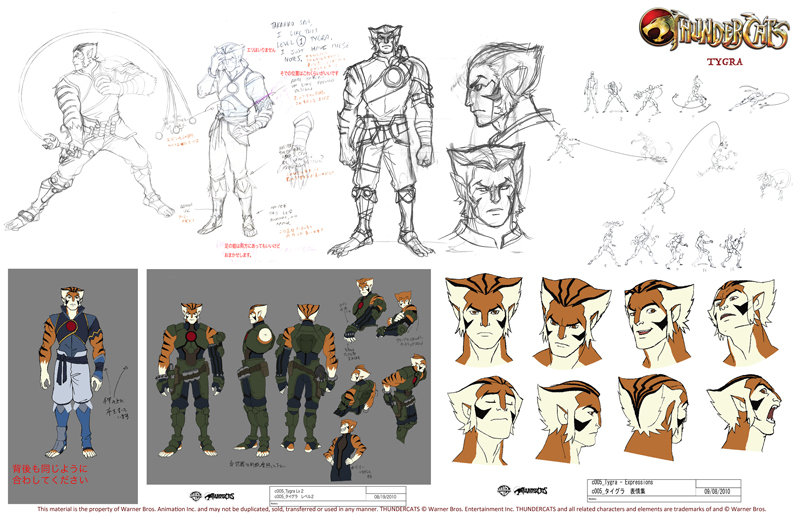
I have mentioned before my love for 80's cartoons here on Muddy Colors, and if any of you attended the IMC this year, you certainly heard me tout it again. So needless to say, I am pretty excited about Cartoon Network relaunching ThunderCats this Friday, July 29th.


I have seen so many movies and comics of late re-vamping old classics (even re-vamps of the re-vamps!), and rarely do they live up to the originals. So part of me was really reluctant to see what they were going to do with ThunderCats. But I must say, I am quite pleased!


The ThunderCats has a really wonderful cast of characters, and such a solid backstory, that there is a TON of potential for a wide variety of interpretations, be it child-like or very adult. You can see some wonderful, un-official renditions of these characters in the recent CGHub challenge.


Ultimately, I think Cartoon Network took a really smart approach. Rather than change the characters dramatically to fit current tastes, they simply changed the animation style. The characters themselves have been altered very little. Even some of the outfits are nearly identical to the 80's version. Yes, the abbreviated style typical of Japanese animation may be to everyone's liking, but it lends itself well to the constraints of animation, and is undeniably popular at the moment, hopefully ensuring the show's success. That is, after all, the real goal... not just appeasing OLD fans, but rather creating a whole generation of NEW fans.


Below are some samples of the pre-production concept art. I particularly love the treatment of WilyKit and WilyKat.


And for a real treat, check out some recently revealed concept art from the original series! It's almost unrecognizable, as it appears the series was initially headed in a totally different direction.
Read More
Posted in Dan dos Santos | No comments

Sunday, 24 July 2011

Design Assistant job available

Posted on 10:02 by Unknown
Tor Books has posted an available job for the position of Production/Design Assistant. The chosen applicant would be working directly under the award-winning Art Director, Irene Gallo.


This is a great opportunity for those who love SFF art, but desire a more stable career than what freelancing can offer. For what it's worth, Irene Gallo herself started at Tor in a very similar fashion.


More info HERE.
Read More
Posted in Dan dos Santos | No comments

Friday, 22 July 2011

R.I.P. Lucien Freud, 1923-2011

Posted on 05:00 by Unknown
It seems there are just way too many deaths in the art community this year.


I am sorry to report that Wednesday night saw the passing of Lucien Freud. After a brief illness, he died in his home at the age of 88. Dubbed "The greatest living realist" by one art critic in the 1980's, Lucien's work was the subject of a large retrospective at the Metropolitan Museum of Art in 1993.


Read more about it here:

http://www.nytimes.com/2011/07/22/arts/lucian-freud-adept-portraiture-artist-dies-at-88.html?_r=1


Read More
Posted in Dan dos Santos | No comments

Thursday, 21 July 2011

Blood Divided

Posted on 08:19 by Unknown
-By Dan dos Santos


Here's a new cover that just went went public yesterday. The image is for the book 'Blood Divided', by K.J. Breaux, and is the sequel to the book 'Soul Born', for which I also did the cover.


For those of you keeping track, this is 'Red Painting #2' that I mentioned earlier this month. Not being completely satisfied with the previous painting, I decided to take some of what I learned, and try it again. Red is a surprisingly difficult color to work with. The problem lies in that the brightest of reds is relatively low in value. If you lighten it, it either shifts orange or pink, and either one in undesirable. The result is, you really have to dull out and darken everything else in order to get the illusion of vibrancy.


Testing the exposure prior to shooting.
For me, the best part about this job was the model shoot. I decided to hire a new model that I found via Model Mayhem. This is always a real gamble for me, because you don't know if they'll be any good. By the time you find out, it's too late. Money and time have both been wasted. In this case, I really lucked out. The model was not only beautiful, but turned out to be sensationally good. Great poses, expressions, hands, everything.


I also did something I hadn't done in a long time... really spend some time on the costume. I don't think there is any element of the costume that I couldn't simply make up if I had to, and usually that's just what I do. However, actually crafting something for the model to wear is not only really fun, but also helps you put more care into it's design. You are also much more likely to come up with new solutions that you might not come up with if you were just drawing the design on paper. But perhaps the most important part of having a good costume is that it helps the model feel more in the role. Spending an hour transforming your model into something else has a psychological impact on their performance. If they feel like someone else, it's easier to act like someone else. The result was a sensational photo shoot. Honestly, I had the perfect shot with the first 20 frames. Lighting, pose, costume... it was all there. All that I needed to do was paint it as is!


In addition to spending some time on the costume, I also spent a little extra time making a model bird. If I know I am going to be painting the same animal several times in a single piece (like a pack of wolves, or flock of birds), it almost always warrants making a maquette. In this case, I just bunched up aluminum foil around a wire armature. I spray painted it black, and viola! The wire armature actually enabled me to bend the wings into new positions, allowing me to experiment with the silhouette of the bird quite easily. It may seem like a lot of work, but in actuality, I only spent about 20 minutes making the thing. I would have spent ten times that amount sorting through Google images trying to find the right poses otherwise.


My assistant helps pose the bird for additional shots after the model leaves.
I painted the image traditionally, using oils on illustration board, at 20 x 30 inches. I scanned it myself, and sent the file off to the client. They approved it without revision, and just sent me the final type treatment a few days ago.


Read More
Posted in Dan dos Santos | No comments

Wednesday, 20 July 2011

'Savage Beauty' update

Posted on 21:21 by Unknown
-By Dan dos Santos


So I just got back from the Alexander McQueen Retrospective at the Metropolitan Museum, and I must say, it was incredible. Quite possible the most amazing exhibition I've ever seen at the Met... period.


I was expecting to see a lot of great work. What I wasn't expecting, was to walk into a custom crafted exhibition hall full of mirrors, projections, sound effects, wind machines, holograms, and rotating mannequins! Seriously, I can only assume the sets alone costed millions of dollars and took months to assemble.


Further more, almost every piece on display had a custom mask made for it, which was not part of the original ensemble, but really heightened the emotional impact of each piece. Yes, I used the word emotional. It's not too often that a piece of art really stirs me, but this show certainly did just that. It was imaginative, scary, sad, and just all around heart-breakingly good. I left the show doubting my career path.


I really wanted to take photos of the rooms for you guys, but they had a very strict 'no camera' policy. And though they have some pictures on the Met's site, I promise you, they do not do the show justice.


The show comes down in just 16 days! Once the exhibition is over, it is over. It will NOT be traveling.

If you are in the NYC area, you need to see it... If you are not in the NYC, you need to see it.
Read More
Posted in Dan dos Santos | No comments

Monday, 18 July 2011

ImagineFX Tutorials

Posted on 07:57 by Unknown


ImagineFX Magazine, an outstanding magazine for those interested in the creation of SF/F art, has long offer a large selection of FREE tutorials on their website. These tutorials, which are taken from back issues of their magazine, often include PDFs, PSDs, and custom brushes.


The kind folks at ImagineFX have now added free video tutorials to the list of freebies they offer! They've only been uploading them for about 3 weeks now, but they already have a great selection of informative vids to sort through, such as:


Vinod Rams shows his thumbnail sketching process:


Dave Gibbons paints Rorschach:


Melanie Delon speed painting:


and Spacecraft design with Koshime:
Read More
Posted in Dan dos Santos | No comments

Friday, 15 July 2011

Spotlight On: JEFF SIMPSON, Part 2

Posted on 02:30 by Unknown
-By Jeff Simpson


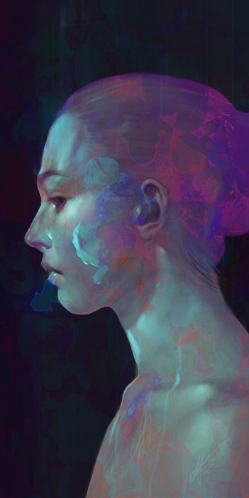
This painting should provide a pretty good representation of how my recent personal works are created.  I’ve almost gotten it down to a formula now, which worries me a bit since I feel like whenever I have gotten used to a certain way of drawing or a certain technique, I need to find something new to keep it fresh and interesting for myself (Having said that though, I still only ever use the hard round default brush....) I greatly enjoy doing personal work, the ability to express yourself and have fun without having to adhere to a clients tastes is refreshing.  As usual I’m using Photoshop CS5 and a medium sized Intuos tablet.


This piece, like most, started out without much of a strong basis or idea.  I like to let a piece sort of find its own way into being..whenever I try to stick to something, it becomes more like work.  This is a personal painting, I do it to have fun and relax and play. Hopefully that ends up being reflected in the piece somehow.  As always, it started out as a portrait. While I am rendering I am always thinking about how I’m going to spice it up or throw in some interesting themes.  This is a TERRIBLE idea since I know I will probably end up erasing or changing what I have spent so much time rendering.  However this doesn’t really bother me since I simply love to render, and the magic of digital painting means nothing is truly lost forever.


I start out with a quick sketch usually straight into photoshop.  To render I usually lay down my darker colors first, then add a mid tone, then lighter tone, then highlights/specular each on their own separate layers so I can easily adjust their opacity or hue if I need to.


I spend a lot of time playing with colour adjust and gradient maps to get something interesting going on.  This also helps unify colours if things are starting to look to muddy.  Recently I’ve been incorporating a lot of textures into my work, I am often asked how they are achieved which I thought surprising since the process is very basic.  I scan in various traditional mediums (usually swatches of acrylic paint or coloured pencil) and adjust their layer settings (I spend a lot of time cycling though the settings to see what looks best).


Colour dodge, overlay and screen are the ones I usually end up using,  I use a layer mask to paint in the parts I want, which I can always modify with a colour adjust a swell.  I am constantly sliding in new textures as I paint too, which helps weave the textures into the image quite nicely.


The blue outline of the figure was actually an old pencil sketch I did from life drawing, hence the pixelation and artifacts which I actually though looked pretty interesting...but ultimately had to town down. During the last third of the process I am rarely actually painting much at all, just adjusting and tweaking the colors and tone.  Sometimes I like to add a unsharp mask or high pass in some areas to help bring out the brushstrokes or little details as a finishing touch.


Thank to Jeff for taking time out his schedule to do this wonderful guest-post for us! Be sure to check out more of Jeff's work at his website: http://jeffsimpsonkh.cghub.com/
Read More
Posted in Dan dos Santos | No comments

Thursday, 14 July 2011

Spotlight On: JEFF SIMPSON, Part 1

Posted on 15:17 by Unknown


Jeff Simpson's talent definitely exceeds his mere 25 years of age. I first stumbled across his work years ago on Conceptart.org, and quickly dragged everything he had available into my inspiration folder.


Hailing from Montreal, Quebec, Jeff currently works as a concept artist at Ubisoft Games. He has numerous projects to his credit, including the soon to be released 'Assassin's Creed: Revelations', and has been working as a pre-production concept artist on the upcoming film 'Snow White and the Huntsman' (starring Kristen Stewart and Charlize Theron).


I think what I really like about Jeff's work is that he doesn't hide his medium. Employing a combination traditional and digital techniques, and playing to the greatest strengths of each, he reaps a result that just can't be achieved otherwise. Tomorrow, Jeff will be our guest blogger for the day and walk us, step by step, through his creative process. Until then, enjoy the work!


More of Jeff's work can be found on his website: http://jeffsimpsonkh.cghub.com/
Read More
Posted in Dan dos Santos | No comments
Older Posts Home
Subscribe to: Posts (Atom)

Popular Posts

  • Lists
    -by Arnie Fenner A few weeks ago Scott Taylor posted an essay on the Black Gate magazine blog, "Art of the Genre: Top 10 Fantasy Artis...
  • Spotlight On: DAVE RAPOZA
    Dave first made it onto my radar a few years ago when I stumbled across his work on Conceptart.org. I then later saw a piece he did for Jon ...
  • Painting Spider-Man
    By Paolo Rivera Mythos: Spider-Man, Page 22 . 2007. Gouache and acrylic on bristol board, 11 × 17″. Just a quick post today (but with lots o...
  • Happy Birthday !!!
    Muddy Colors turns one year old today! Traditionally, first anniversaries are celebrated with 'a gift of paper' . So that's what...
  • Frank McCarthy
    -by Arnie Fenner While putting together my previous post about movie posters, scratching my head and trying to remember who did what, I a...
  • Sketchbook 2012 Shipping Out!
    by Justin Gerard Sketchbook 2012: Ents & Orcs  ships out today!    The first 50 are individually numbered and have a personal drawing in...
  • The History of Dragons in Art
    -By William O'Connor 'Flight of the Paladin', by William O'Connor, ©2012 The most iconic image in all of fantasy art is the ...
  • Paja Jovanović ( Vršac 1859 – Vienna 1957)
    by Petar Meseldžija Paja Jovanović is one of the greatest Serbian painters. Uroš Predić, another great painter, is perhaps the only artist f...
  • How to Draw the Head From Any Angle: Part 2
    Thanks to the great reception his first video received, Stan Prokopenko , has decided to do a follow up to his ' How To Draw the Head fr...
  • ParaNorman Behind the Scenes
    Ain't it Cool News did a great write up on the making of ParaNorman . The pictures are absolutely awesome! Read the article  HERE , and...

Categories

  • Dan dos Santos
  • Justin Gerard
  • Paolo Rivera

Blog Archive

  • ▼  2012 (266)
    • ▼  September (4)
      • SiDEBAR interview with Michael Kaluta
      • 2012 Hugo Award Winners
      • Painting Spider-Man
      • Sergio Toppi 1932-2012
    • ►  August (36)
    • ►  July (33)
    • ►  June (36)
    • ►  May (36)
    • ►  April (26)
    • ►  March (31)
    • ►  February (30)
    • ►  January (34)
  • ►  2011 (234)
    • ►  December (25)
    • ►  November (34)
    • ►  October (36)
    • ►  September (27)
    • ►  August (29)
    • ►  July (35)
    • ►  June (31)
    • ►  May (17)
Powered by Blogger.

About Me

Unknown
View my complete profile