Create Web Sites

  • Subscribe to our RSS feed.
  • Twitter
  • StumbleUpon
  • Reddit
  • Facebook
  • Digg

Wednesday, 14 December 2011

Gatorade Color

Posted on 21:00 by Unknown
-By Justin Sweet


Put down the brushes and Wacom pen and picked up my pole and went fishing with my son and his friend. Once the poles were in the water, I dug out a brush from my bag, quickly dipped it in Gatorade, picked up some pigment from my little metal tin, and splashed it inside my sketchbook. Caught some fish too..


and some other drawings...


Thanks for looking.


-Justin
Read More
Posted in | No comments

Tuesday, 13 December 2011

Pirate Paintings for National Geographic Pt. 8

Posted on 21:01 by Unknown


Gregory Manchess


This ends the series of pieces for REAL Pirates: The Untold Story of the Whydah from Slave Ship to Pirate Ship. These two portraits were finished earlier in the deadline rush than the last painting of the dock scene. The first portrait is of John Julian, about sixteen years old when he joined the pirate crew as pilot, valued for his navigational skills.


The child is John King, a most unpleasant little guy. When he and his mother were captured by Black Sam Bellamy, he threatened to kill himself if his mother did not let him join the pirates. She refused.


Apparently, his relationship with his mother was a bit strained as he then threatened to kill her. So, she let him go. Smart mother. Perhaps it was about time to cut the little snot loose.


The client wanted to depict King with a bit of an attitude, so I gave him the up-thrust chin, and they liked the dirt on his scruffy face. We all figured that kids would love to see a real child-pirate, living the dream, however cruel and dangerous it was in those days. There were plenty of young boys who went to sea back then, so it probably wasn’t such a bad deal for him.


Except that a couple of masts and who knows how many cannon crushed the poor brat into the sand when the ship went down in an April storm off the coast of Cape Cod in 1717. Amazingly, the divers found one of his shoes, with the sock and part of his leg bone still in it. Those are on view in the exhibition.


I didn’t do a lot of explorative sketching for these two. I looked up reference for faces and bodies, using myself as a stand-in for Julian, and cobbled it all together. Below the sketches are the sequential shots of building the paintings.


Read More
Posted in | No comments

Let's Draw Warthogs

Posted on 03:00 by Unknown
By Justin Gerard


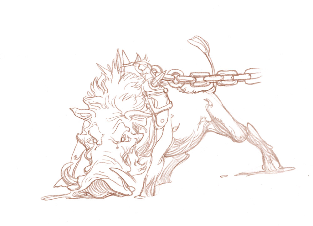
I have an upcoming illustration project that has warthogs in it. Before I begin, I am taking some time to familiarize myself a little better with these ugdorable creatures.


"I wake up in the morning, I look in the mirror, and I ask myself; just how did you get so good looking?"


I often do this before starting on a drawing that has animals or costumes I am unfamiliar with. (The drawings, not wondering how I got so good looking.) I like to do studies from life when I can, or photos when no models are available. 
As I draw from my reference, I try to commit everything I can to memory.  Most of this will happen automatically as you draw. Your brain beings to see certain things as correct and others as incorrect.  


Studies from photos


After you have worked from the photo it is amazing how much information your memory retains. Details you didn't realize you were taking in come back to you as you draw.  


From Memory


The next drawings, done from memory with no reference around, will lack the sharpness and realism of the ones worked from the reference, but they will have a little more personality to them and I usually find them more interesting. 


 Once I feel like I have a decent understanding of my subject I start on the final drawings for my illustration.


Warthog Tracker #1


Warthog Tracker #2 


Later on, when I am into the final illustration I will bring out my reference again to fact-check, and make sure I haven't put an extra leg in there somewhere.  My brain is good, but it has been known to trip over itself from time to time.


Most of this method of handling reference with illustration I blatantly stole from the Disney artists.  On some films, like the Lion King, they would have workshops where they would bring in an actual lion and do life drawings of it before they began work on the film.  It was a very good way of both keeping the personality in the character, while at the same time making sure it is anatomically coherent and believable.


Edit: (Thank you raphael for mentioning it!)

To see this process more clearly outlined and executed, check out Ian McCaig's Visual Storytelling Tutorial from the Gnomon Workshop. It is a really excellent demonstration and has been very influential for me in how I approach using reference.
Read More
Posted in Justin Gerard | No comments

Sunday, 11 December 2011

MC Crew Gift Ideas

Posted on 21:07 by Unknown
More gift ideas from the Muddy Colors Crew.


Here are a few last minute gift ideas from the Muddy ColorsCrew. Yes - we are blantly promoting our stuff...


 Justin Gerard's Sketchbook 2011


Donato Giancola's  
Middle-Earth: Visions of a Modern Myth


Dan Dos Santos DVD Creating a book cover: “Warbreaker” for Tor Books


Petar Meseldzija’s 
"The Legend of Steel Bashaw"“


John Jude Palencar’s  
 "Origins"


Read More
Posted in | No comments

Friday, 9 December 2011

Work in Progress

Posted on 05:07 by Unknown
by Eric Fortune


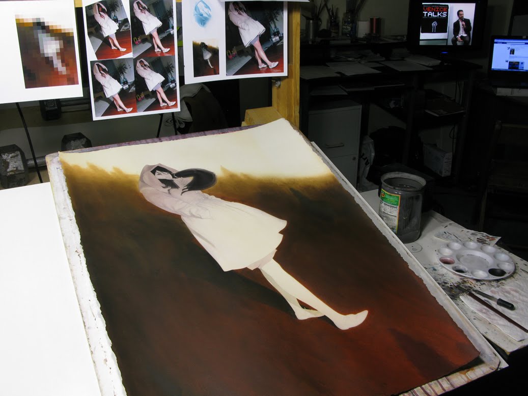
I have a few different pieces I'm currently working on. Here's what I've been spending my time on the passed few days. As you can see I have my photo ref posted up. If you're not into using photo reference or find yourself struggling with figurative issues, drapery issues, any other issues go get some reference. I highly recommend taking your own reference. This is consistently my most offered advice to art students besides "do art as often as possible".


One thing I've been doing lately which I find helpful is making a very low res version of my color comp that breaks down the image into large blocks of color. It makes for a nice palette guide.


I focused a lot of my initial time doing wet on wet washes on the background. I knew I wanted the background to be fairly dark and chromatic. Having these large dark areas blocked in early helps give me some relative sense of value for the figure and the rest of the piece. Painting on an all white surface can be rather misleading. Context is important and can often make things look dark enough when they should probably be darker. As you can see I've started in on the figure though she has a long way to go.


Read More
Posted in | No comments

Thursday, 8 December 2011

Conan Commission, part 2

Posted on 01:06 by Unknown

by Petar Meseldzija


The underpainting – This
is always a fun part for me. It is relatively relaxing because I don’t have to
think about the color, or the brushwork. My only concerns during this stage are
the FORM and the VALUE arrangements.  I
find this moment very exciting and inspiring, for the world of the future
painting starts to reveal itself for the first time. You see a kind of magic
evolve in front of you, as the white shapeless gesso surface turns into a
suggestive two-dimensional world. True magic, indeed. But that’s the essence of
Art, after all.  In its core, it still
echoes the ancient magical ritual.


These are the colors
I use for my underpainting. From left to right: titanium white, yellow ochre,
cadmium red light, alizarin crimson, burnt umber, permanent red-violet and
cobalt blue.


The underpainting in progress.


The finished
underpainting, and a detail.


The real work starts from this point on. I leave the relative
safety of the “harbour”, and “sail” towards the unpredictable open waters of the
“Ocean”. Before that I might address Minerva ( the Roman goddess of poetry,
wisdom, art, magic, etc.) in a quick prayer, asking her to help me and my
little “ship”, to reach the other side safe and sound.


Each painting is (should
be) a new adventure, a unique act of discovery.  


As Marcel Proust, a
famous French author and critic, said: “ The only true voyage of discovery …
would be not to visit new landscapes, but to possess other eyes, to see the
universe through the eyes of another, of a hundred others, to see the hundred
universes that each of them sees”. (Also often seen
translated in the shortened form: “The only real voyage of discovery consists
not in seeing new landscapes, but in having new eyes)”.


Read More
Posted in | No comments

Wednesday, 7 December 2011

Focal Point

Posted on 02:15 by Unknown
By - Jesper Ejsing


Thinking back on Illuxcon I realize that I said the same thing to everyone approaching me with a portfolio or asking me to review their artwork. Maybe it is because it is the one thing I got right, or maybe it is because it is something you can apply to almost every illustrative painting. Anyway; the thing is “Focal Point”.


Every illustration has an area where I want you to look first; a place that first of all, should draw the eye. That is the focal point. To me it is almost always the face of the hero or the main figure. That point should, in every way, be the brightest, the most detailed, the most saturated, the most contrast full and the place where all the compositional elements are pointing toward.


Like ripples in water, the further you move away from the focal point, you drain away color, detail and so on. In the farthest area away from the focal point the painting should seem almost grayish and on focused to not draw any attention at all. If not, the reading of the painting becomes confused and the eye starts to wander aimlessly around not knowing in which order to understand what it is seeing.


This image is an illustration called Rune Claw Bear from Magic the Gathering. To show what I mean I have circled in the area of interest, the focal pint, and added the “ripples”. The tools you can use for emphasizing the focal point is these:


Texture:
I try to add the most detailed strokes in the face and shoulder of the bear. The tongue is very detailed and the strokes are fine. Compare the rough and broad brush strokes in the cliffs or the stomach. In using different size of brushes I automatically get the texture difference I need.


Contrast:
I added the strongest rim light to the face and the shoulder. The black nose vs the white light, the light teeth vs the black hole of the mouth are sharp contrasts that makes this area look more important. It is the same rim light that is on the cliff behind his right claw, but I sucked out the light of it making the contrast much less obvious. Imagine what I white rim light would have done out there in the background?
Everything but the main figure has no super dark or black in it. It is all kept in less contrast to make it disappear.


Saturation:
I used orange/reddish brown around the focal point: yellow and white for the light. The rest of the Bear is more dark brown. For every ripple I go a bit more dark and less saturated. Especially in the background you can see it almost looks like there is a filter of more and more grey being put in front of the lens.


Brightness:
The lightest value will also keep the eye focused. That being said I think I needed a light source within the frame and added the sun shining through the trunks. It is a second focal point, but I consciously put it close to the face to even up. But still I kept the brightest part of the bear to the top and the face.


Composition:
I used the trunks and the cliffs as a frame for the figure. The tall vertical threes creates an ease that makes the dynamic shapes of the bear stand out: Also the sticks from the trunks points toward the focal point, the skeletal bones do the same. Even the arms of the bear points toward the face.


You can easily create a fantastic painting without getting every one of these points right. In multiple figure paintings you need to soften up a lot of the rules, but still, knowing what these elements do and how to play them, is a key to making a successful told story. And every painting is a story.
( even a little tiny story of a Bear saying “RAHHHHg, my kill. Stay away”)
Read More
Posted in | No comments
Newer Posts Older Posts Home
Subscribe to: Posts (Atom)

Popular Posts

  • Lists
    -by Arnie Fenner A few weeks ago Scott Taylor posted an essay on the Black Gate magazine blog, "Art of the Genre: Top 10 Fantasy Artis...
  • Spotlight On: DAVE RAPOZA
    Dave first made it onto my radar a few years ago when I stumbled across his work on Conceptart.org. I then later saw a piece he did for Jon ...
  • Painting Spider-Man
    By Paolo Rivera Mythos: Spider-Man, Page 22 . 2007. Gouache and acrylic on bristol board, 11 × 17″. Just a quick post today (but with lots o...
  • Frank McCarthy
    -by Arnie Fenner While putting together my previous post about movie posters, scratching my head and trying to remember who did what, I a...
  • Happy Birthday !!!
    Muddy Colors turns one year old today! Traditionally, first anniversaries are celebrated with 'a gift of paper' . So that's what...
  • The History of Dragons in Art
    -By William O'Connor 'Flight of the Paladin', by William O'Connor, ©2012 The most iconic image in all of fantasy art is the ...
  • Paja Jovanović ( Vršac 1859 – Vienna 1957)
    by Petar Meseldžija Paja Jovanović is one of the greatest Serbian painters. Uroš Predić, another great painter, is perhaps the only artist f...
  • Painting the X-Men
    By Paolo Rivera Mythos: X-Men, Page 8 . 2005. Oil on board, 16 × 24″. I've been a Muddy reader since the blog's inception, so it...
  • Sketchbook 2012 Shipping Out!
    by Justin Gerard Sketchbook 2012: Ents & Orcs  ships out today!    The first 50 are individually numbered and have a personal drawing in...
  • Alien Portraiture
    By Terryl Whitlatch Towards the end of my tenure at JAK films (aka the Star Wars—the Phantom Menace Art Department), I started to work on ot...

Categories

  • Dan dos Santos
  • Justin Gerard
  • Paolo Rivera

Blog Archive

  • ▼  2012 (266)
    • ▼  September (4)
      • SiDEBAR interview with Michael Kaluta
      • 2012 Hugo Award Winners
      • Painting Spider-Man
      • Sergio Toppi 1932-2012
    • ►  August (36)
    • ►  July (33)
    • ►  June (36)
    • ►  May (36)
    • ►  April (26)
    • ►  March (31)
    • ►  February (30)
    • ►  January (34)
  • ►  2011 (234)
    • ►  December (25)
    • ►  November (34)
    • ►  October (36)
    • ►  September (27)
    • ►  August (29)
    • ►  July (35)
    • ►  June (31)
    • ►  May (17)
Powered by Blogger.

About Me

Unknown
View my complete profile