Thanks again for all the wonderful submissions, guys! I swear some of you are just trying to show off. Quite a few of the pieces were really spectacular, and definitely not in need of any real critique. Perhaps we'll share those here someday.
I've chosen a piece by Ryan Valle, that I personally thought was quite close to being successful, but just suffered from a few minor faults.
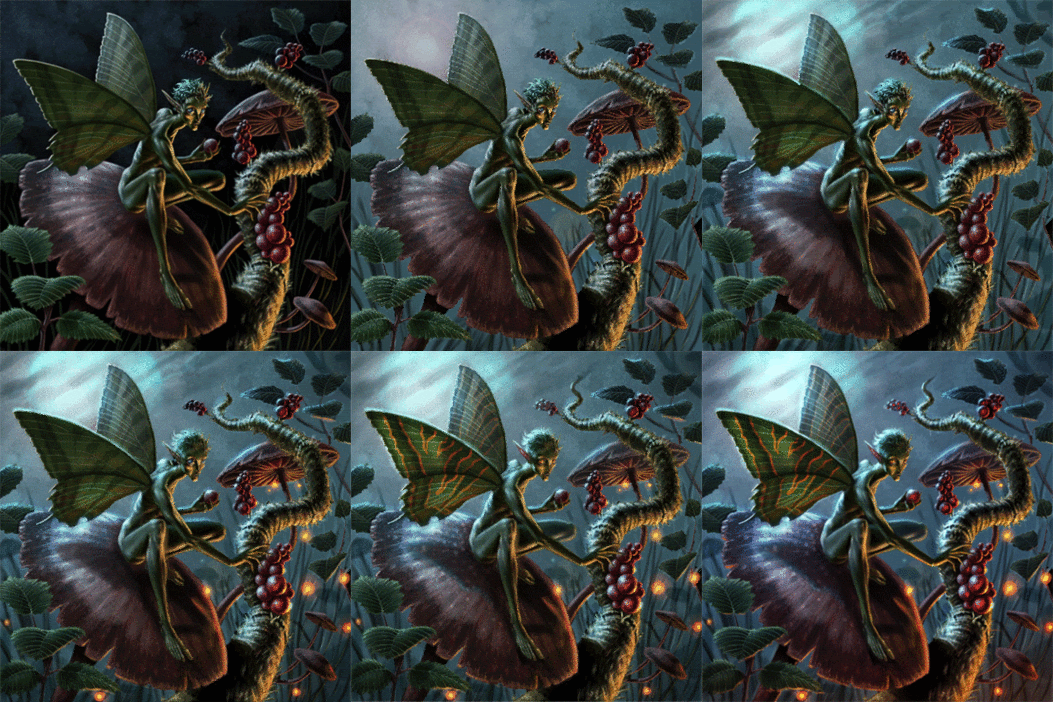
The first thing that struck me about this piece was it's inefficient use of black. Like white, black is a really potent color and needs to be used sparingly, usually reserved for the subject and foreground elements. In most lighting situations, even at night outdoors, the distance fades to grey... not black. The exception to this rule are things like caves where there is no ambient light at all. Here, I felt the black background did more harm than good.
The first step was to lighten the background. I just drew a lasso around all the black, lightened it up using 'levels', and added a little bit of lens flare to see if I liked it. Any variation in the sky's color was already there... it was just too dark to see.
I did like the way the lens flare helped to pop the figure, so I pushed it further and painted it into a moon. I also amplified the backlighting on the subject to help reflect this change.
The subject never felt particularly 'grounded' to me, mostly due to a lack of believable shadow. In the pic above, I simply added a more obvious cast shadow from the figure onto the mushroom. I also added the indication of a few more background elements (hidden amongst the grass) to help push the sense of depth.
The fill light on the front of the figure was a bit unjustified... and actually a tease. We know something must be illuminating him, but what? A lantern, a bug, a village? Narratively speaking, the piece is better off showing the source of that light. In this case, I felt lightning bugs would do the trick.
The artist chose to give the fairy blue eyes in the original piece, shown above.
I felt the subject would be better served with orange eyes, to help make him stand out more.
Liking the way the orange of the eyes popped against the blue, I decided to push those orange accents even further, and added some additional decoration to his wings. I also added a bit of glow inside the berries to make them look a bit more magical. Again, this was a narrative consideration. Maybe the berries aren't food, perhaps they are medicine, or eggs?
I adjusted the color balance here just to accentuate the blue/orange theme.
Lastly, I added a bit of orange glow to the bottom of the canvas to imply that more may be going on just beyond our view.... giving us our final picture.
And here is a small GIF to help you see the process:
Thanks again to everyone who participated, we really appreciate your enthusiasm. And a special thanks to Ryan Valle for being brave enough to let us all learn from his work.
Stay tuned, as I may post a few more crits over the weekend that I already started, but just need to polish up!


0 comments:
Post a Comment